Fuente: Ryan Detrick
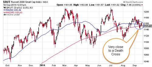
Have you heard the news yet? The Russell 2000 (RUT) is set to complete a very bearish Death Cross any day now. This technical pattern happens when the faster moving 50-day moving average moves beneath the slower moving 200-day moving average. The thinking is this is a warning of an impending huge and fast drop in prices. The opposite (and bullish) pattern is called a Golden Cross. Here’s what the almost completed Death Cross looks like.
This week, I’ve seen this mentioned all over CNBC, all over Twitter, and even Reuters was talking about it. Here’s what you need to know about this ominous event, it isn’t really bearish. That’s right, turns out not all Death Crosses (and Golden Crosses) are created equal.
In early April, I took at look at the Golden Crosses that had just occurred in the SPDR Gold Trust (GLD) and the iShares Barclays 20+ Year Treasury Bond Fund (TLT). Noted the results were bullish for the TLT and bearish for the GLD. Many gold bugs didn’t like hearing this, but if you’ve watched the price of gold this year, once again it played out nicely to fade the Golden Cross. The flipside is bonds have done great, just as the Golden Cross predicted.
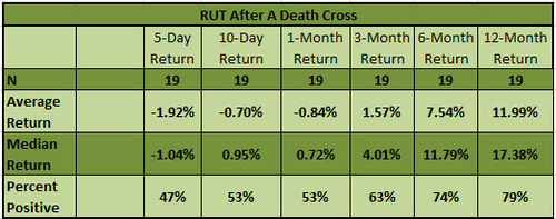
This brings us to the current Death Cross in the RUT. Since December 1988 the RUT has seen 19 Death Crosses. Here are the returns after.
Now compare that to the results after a Golden Cross.
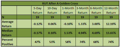
Very near-term we do see some underperformance after a Death Cross, but once you get out to three months the returns are actually better after a Death Cross than after a ‘bullish’ Golden Cross. Not what most would have expected I’m guessing.
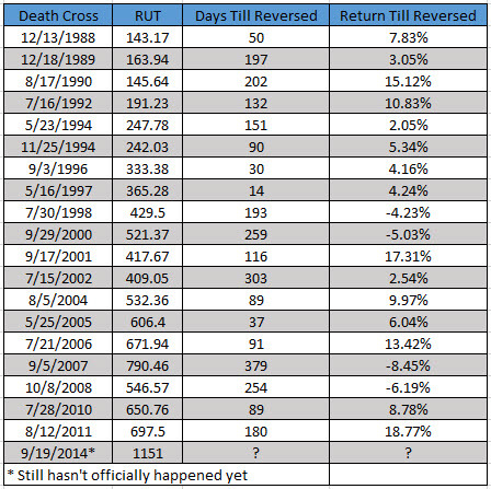
Here are all the Death Crosses, calendar days till there was a Golden Cross, and the return till the Golden Cross. Had you shorted the last Death Cross in 2011 you’d have been down nearly 19% by the time it reversed. Had you shorted all 19 signals you’d have lost 5.55% on average and only made money 4 times!

That sure doesn’t look as bearish as everyone makes it out to be now does it? Here are the returns after the Golden Crosses.
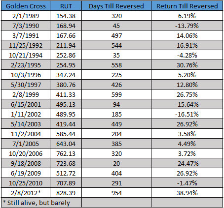
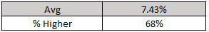
The average return is a little bit better, but not really by that much. The recent Golden Cross in February 2012 is the longest in terms of length and the +39% gain is the best ever. You have to hand it to the bull market recently, it is definitely a record breaker in a lot of ways. This is just another.
So there you go. Could this pending Death Cross be bearish? Sure, this could mark the beginning of a big downtrend, but don’t be fooled into thinking it is this clear-cut bearish signal, as that simply isn’t true.
No hay comentarios:
Publicar un comentario