martes, 30 de septiembre de 2014

Telefónica: ¿H-C-H a la vista?


Fuente: Jose Tamborero    Inbestia.com    www.tambolsa.es


Aún queda pendiente lo más importante, pues la debilidad general del mercado ha impedido que el valor sea capaz de superar la línea clavicular de la pauta, situada en torno a los 12,5 euros. Y, sin dicha confirmación, es imposible hablar de nuevo tramo alcista.


Telefonica%2B2014-09-28.gif


Objetivo

Por otra parte, un vistazo al gráfico semanal nos permitirá establecer los objetivos de la operativa. Como target principal seleccionaremos el máximo relevante del nivel 15,50 euros de octubre-2011 (una ganancia potencial del +24%). Como target secundario se podría escoger el techo del año 2011, situado en el nivel 18,20 euros (un +45%). Obsérvese la directriz alcista de medio plazo que gobierna al movimiento desde el año 2012.


Telefonica%2B2014-09-28%2Bv2.gif


Y eso es todo. Tal y como hemos dicho más arriba, ahora sólo nos queda esperar y ver si finalmente tenemos confirmación del patrón alcista de H-C-H.

Bestinver: sigue la fuga de capital


Fuente: Morningstar.es   Fernando Luque


Según nuestras estimaciones los reembolsos alcanzarían casi los 600 millones de euros desde el pasado 24 de Septiembre.


La semana pasada publicábamos las salidas de dinero sufridas por los fondos de Bestinver a fecha 24 de Septiembre. Hoy podemos añadir los datos del 25 de Septiembre. Nuestra tabla de flujos desglosada por fondo quedaría de la siguiente manera: 


Fuente: Morningstar Direct (25/9/2014)

Nota: Es importante recordar que los datos de flujos netos que publicamos son estimaciones realizadas por Morningstar y calculadas en base a las rentabilidades y patrimonios dairios. 

Mapfre : Buen fundamental y técnico


Fuente: Bolsacanaria.info


bolsacanaria.info >>


bolsacanaria.info >>


Beneficio estimado para 2014= 889 mill. euros

Capitalizacion (2,786) =   8.580 mill. euros

PER= 9,65

Valor contable: 2,755 euros

domingo, 28 de septiembre de 2014

EEUU: Invertir en empresas que recompran acciones da muy buenos resultados


Fuente: Xavier Brun    Inbestia.com


798d4c7c8bdc67c1e34a283aed3defcfa21442f4

Rentabilidad últimos 10 años
4fdd26a6d74d31fb39b2e7911198f617a796dde5


Rentabilidad últimos 20 años
d3763eacce5cb4be1126b451a1a83b818e39e8e0


ETF QUE PERMITE ESTE TIPO DE INVERSION:

fuente: invesco.com


PKW - PowerShares BuyBack Achievers Portfolio

Access - BuyBacks
as of 09/26/2014

Sector Allocation

Consumer Discretionary 34.30%Information Technology 16.37%Financials 10.94%Health Care 10.91%Industrials 7.46%Telecommunication Services 6.34%Energy 5.74%Materials 5.17%Consumer Staples 2.21%Utilities 0.54%
as of 09/25/2014

Market Cap & Style Allocations

Large-Cap Value17.89%
Large-Cap Blend24.69%
Large-Cap Growth22.06%
Mid-Cap Value13.16%
Mid-Cap Blend8.90%
Mid-Cap Growth7.32%
Small-Cap Value1.73%
Small-Cap Blend3.20%
Small-Cap Growth1.07%

as of 09/26/2014Top Holdings | View All

Fund Holdings subject to change
Ticker
Company
% of Fund
HDHome Depot Inc/The5.69
PFEPfizer Inc4.97
TAT&T Inc4.95
ORCLOracle Corp4.77
HALHalliburton Co3.26
GMGENERAL MOTORS CO3.12
LOWLowe's Cos Inc3.11
DTVDIRECTV2.56
YHOOYahoo! Inc2.40
TWCTime Warner Cable Inc2.37

OPA de Jazztel


Fuente: Bankinter


Fondos de inversión accionistas de la compañía intentan forzar una subida de la OPA 


Tras el rechazo del fondo de inversión Alken a la OPA presentada por Orange y su 
aumento de participación desde el 5% hasta el 20%, otros fondos de inversión han comenzado a aumentar su participación en Jazztel con el objetivo de lograr una oferta más atractiva por parte de Orange. Además de Alken, JP Morgan Asset Management ha aumentado su participación hasta el 1,07% y la firma AQR, especializada en el 
arbitraje de fusiones y adquisiciones, ha adquirido un 1,7% de la compañía. 

Nuestra recomendación continúa siendo acudir a la OPA de Orange de 13,0€ en efectivo cuando ésta se materialice por las siguientes razones:

(i) consideramos que 13,0€ es un precio atractivo, que implica pagar un múltiplo EV/ Ebitda de 12x, superior al que se ha pagado en operaciones similares.

(ii) La mayoría de los accionistas que se han pronunciado hasta ahora han aceptado la OPA, ya que la oferta satisface tanto al presidente de la compañía, con una participación del 14,5%, 
como a otras gestoras de fondos como GO Investments y Fidelity, que suman en 6,5% de participación. 

(iii) La probabilidad de que se presente una oferta más elevada es reducida, ya que los accionistas de Orange consideran que el precio ofrecido ya es muy elevado y no parecen existir otros candidatos competidores, ya que el encaje de Jazztel en la estrategia de otras grandes compañías europeas sería más complicado que en Orange, que ya es el 
tercer operador móvil en España. 

(iv) Esperar a que se anuncie oficialmente el plazo para acudir a la OPA permitiría beneficiarse de esa hipotética mejora de la oferta que, como se ha mencionado, consideramos que tiene una probabilidad reducida. 


sábado, 27 de septiembre de 2014

EEUU: Más avisos


Fuente: Zerohedge.com     Bank of America


Net free credit is free credit balances in cash and margin accounts net of the debit balance in margin accounts. Net free credit dropped to -$182b and moved to a new low below the prior record of -$178b in February. This measure of cash to meet margin calls remains at an extreme low or negative reading below the February 2000 low of $-129b.

The risk is if the market drops and triggers margin calls, investors do not have cash and would be forced to sell stocks or get cash from other sources to meet the margin calls.
This would exacerbate an equity market sell-off.


Fuente: Ryan Detrick


jlfmi:

The Most Important Trendline In Equity Land: New Highs-New Lows
The problem with trendlines is that they are usually subjective. Rarely are they cut-and-dry. And even when they are obvious, it has become more commonplace recently that breaks of trendlines, up or down, have been false moves. That’s not too surprising given the tremendous increase in traders and investors adopting technical analysis as well as widespread access to such resources. The more attention that is focused on a particular type of analysis, the harder it is to exploit such analysis. Thus, the exploiters become the exploitees. Whether it’s the algo-bots or simply the collective market forces that forbid the consensus of participants from profiting from “obvious” signals, trendline breaks are now very often fakeouts. As often as not, it seems, prices revert back to the primary trend in short order causing traders to…draw a new trendline. Thus, the subjectivity.
Therefore, our pick for the most important trendline to watch in the world of equities is not an equity, or equity index, at all. It is an indicator. Whereas equity trendlines are prone to false breaks of late, indicators often conform to truer, more reliable trendlines. But why would an indicator trendline be the most important? Considering this market environment is one characterized by divergences and weakening internals — perhaps moreso than any time since the 1998-2000 period — a focus on that dynamic seems more than appropriate.
The indicator we have selected for this distinction is the number of New 52-Week Highs minus New 52-Week Lows on the NYSE. We’ve discussed the weakening trend of New Highs several times over the past few months, including on September 10, September 2, July 25 and May 1. The reason we chose this particular indicator is due to A) the cleanliness of the trendline and B) the degree to which it has been helpful in the past.
As we have cautioned ad nauseam, the difficulty with divergences is the unpredictability in timing their impact. They can persist for a long time without serious consequences. One way to combat that unpredictability is by using a trendline, or similiar method, to detect when the indicator breaks down (or out). This can signify a point of impact.
For example, New Highs have been declining for some time so we need a way of determining when that trend will matter. Since they do not have much room to break down, as they are bound by zero, we use the spread between New Highs and New Lows. Looking at this indicator, we can see clear, distinct uptrends from cyclical lows to cyclical tops (by the way, we could use simply New Lows but we like the added information of having both series in the indicator).
This analysis was very helpful in identifying major turns in the past two cycles. On the chart, you can see that New Highs-New Lows made a series of higher lows from 1998 to 2000. During the sell off in September 2001, the indicator broke the uptrend, spiking lower. This was a head’s up that the major trend was broken. FYI, yes the large cap indexes clearly topped in 2000 and had already suffered major damage by September 2001; however, many small and mid caps held up fairly well in 2000 and early 2001 (of course, many of them suffered bear markets from 1998 to 2000). It wasn’t until until 2001 than many of them broke trend and began their descent into the real carnage of 2002.
Likewise, from 2004 to 2007, New Highs-New Lows formed a similar uptrend. The trendline break was a more timely one this time, occurring in July 2007, just off the top. It was again a head’s up that more serious damage was to come than the mild corrections of the years prior.
Currently, we see the same condition. While the NYSE New Highs have been steadily declining, the uptrend in New Highs-New Lows is still in force, stretching back to 2011 (and 2009 as well, but we like to start the trend over after the  indicator breaks out to the upside like it did in 2010.)
It has paid and will likely continue to pay to avoid becoming too bearish from a longer, cyclical-term perspective until this uptrend line breaks. It will likely do so into a “warning shot” sell off as in 2001 and 2007. That is, it will occur into a sharp pullback that, while perhaps too late to warn of that concurrent weakness, will provide a warning that the longer-term picture has changed, for the worse.
** FYI, despite the recent rise in New Lows, it does not appear as if the New High-New Low uptrend line will be threatened today, as the statistics currently stand.
________
More from Dana Lyons, JLFMI and My401kPro.

jueves, 25 de septiembre de 2014

Golden and death cross, también fallan


Fuente: Ryan Detrick


Have you heard the news yet?  The Russell 2000 (RUT) is set to complete a very bearish Death Cross any day now.  This technical pattern happens when the faster moving 50-day moving average moves beneath the slower moving 200-day moving average.  The thinking is this is a warning of an impending huge and fast drop in prices.  The opposite (and bullish) pattern is called a Golden Cross.  Here’s what the almost completed Death Cross looks like.  

image

This week, I’ve seen this mentioned all over CNBC, all over Twitter, and even Reuters was talking about it.  Here’s what you need to know about this ominous event, it isn’t really bearish.  That’s right, turns out not all Death Crosses (and Golden Crosses) are created equal.  
In early April, I took at look at the Golden Crosses that had just occurred in the SPDR Gold Trust (GLD) and the iShares Barclays 20+ Year Treasury Bond Fund (TLT).  Noted the results were bullish for the TLT and bearish for the GLD.  Many gold bugs didn’t like hearing this, but if you’ve watched the price of gold this year, once again it played out nicely to fade the Golden Cross.  The flipside is bonds have done great, just as the Golden Cross predicted.  
This brings us to the current Death Cross in the RUT.  Since December 1988 the RUT has seen 19 Death Crosses.  Here are the returns after.

image

Now compare that to the results after a Golden Cross.

image

Very near-term we do see some underperformance after a Death Cross, but once you get out to three months the returns are actually better after a Death Cross than after a ‘bullish’ Golden Cross.  Not what most would have expected I’m guessing.  
Here are all the Death Crosses, calendar days till there was a Golden Cross, and the return till the Golden Cross.  Had you shorted the last Death Cross in 2011 you’d have been down nearly 19% by the time it reversed.  Had you shorted all 19 signals you’d have lost 5.55% on average and only made money 4 times!

image
                                          image

That sure doesn’t look as bearish as everyone makes it out to be now does it?  Here are the returns after the Golden Crosses.

image
                                          image

The average return is a little bit better, but not really by that much.  The recent Golden Cross in February 2012 is the longest in terms of length and the +39% gain is the best ever.  You have to hand it to the bull market recently, it is definitely a record breaker in a lot of ways.  This is just another.
So there you go.  Could this pending Death Cross be bearish?  Sure, this could mark the beginning of a big downtrend, but don’t be fooled into thinking it is this clear-cut bearish signal, as that simply isn’t true.  

Estas divergencias pasarán factura.....


Fuente: Bolsacanaria.info


* Estamos en septiembre-octubre, meses de crashes históricos 
* Los bajistas han desaparecido 
* Divergencias por todos los lados.....

A mi todo ésto me da cierto vértigo...


SP500

SP500 24 SEPTIEMBRE 2014


ANALISIS ESTRUCTURAL SP500 3 MAYO 2014


NASDAQ

NASDAQ COMPOSITE 24 SEPTIEMBRE 2014

miércoles, 24 de septiembre de 2014

Vistazo al crude oil


Fuente: Eduardo Faus. Renta 4 Banco


Su estructura alcista desde 2010 se pone en evidencia en la zona de 90$, donde presenta el paso de la directriz alcista desde aquel año. 


Los indicadores semanales se encuentran en parámetros desde donde suelen generarse ciertos rebotes. Pese a que no tenemos un suelo confirmado, podría optarse por la toma de posiciones con stop de protección en 88$. 


Fuente: Clivemaund.com


Terremoto en Bestinver


Fuente: Javier Sáenz de Cenzano     Morningstar.es


En el día de ayer Bestinver ha comunicado oficialmente a Morningstar que Francisco García-Paramés deja la compañía con efecto inmediato. Morningstar ha decidido, como es habitual en casos de salidas de gestores, poner Bajo Revisión (Under Review) los fondos de Bestinver que contaban con Morningstar Analyst Rating otorgado por parte de nuestros analistas. En nuestra opinión, el papel de García-Paramés en el equipo era clave y queremos evaluar el impacto que tendrá dicha salida en los fondos. 


Bestinver ha comunicado también que los co-gestores Fernando Bernad y Alvaro Guzmán de Lázaro permanecen en la compañía, aunque en nuestra opinión existe riesgo de que también salgan de Bestinver a corto o medio plazo. La firma también ha informado sobre su intención de realizar nuevas contrataciones muy próximamente a nivel de equipo de gestión, con la idea de estabilizar el equipo y más adelante ampliar la gama de producto con fondos de estilo de gestión diferente al seguido en los productos actuales. 

Nuestra recomendación para los inversores en estos fondos es esperar y evaluar el impacto de los cambios antes de tomar una decisión precipitada. Las inversiones de Bestinver siempre han estado centradas en ideas a largo plazo y la salida de García-Paramés no tendrá un impacto en las ideas de inversión de la cartera a corto plazo. En cuanto a la liquidez de las inversiones para hacer frente a una potencial salida de dinero por parte de los partícipes, los fondos cuentan con un colchón importante de liquidez y una exposición elevada a compañías líquidas, aunque esto es una fuente de riesgo potencial y es un aspecto que analizaremos con detalle lo antes posible así como en el momento de nuestra reunión con el equipo de gestión y el equipo directivo. 


Fuente: Bankinter


Con cifras a junio'14, Bestinver logró unos ingresos de 70M€ y un EBITDA de 44M€ (9,32% del total de Acciona), con unos activos bajo gestión de 10.198M€. Estimamos un valor de mercado para Bestinver de 500M€ (ratio de 0,05x sobre activos gestionados), por lo que la caída de ayer de Acciona implicaría que el mercado descuenta una pérdida de valor de la gestora del 40%, algo razonable. La compañía ha reaccionado rápido y ayer mismo anunció a un nuevo Director General de Inversiones: Beltrán de la Lastra. Éste procede de JP Morgan y tiene una dilatada experiencia en el sector. No obstante, señalaríamos que era co-gestor del fondo JPM Europe Focus Fund que contaba con una posición del 2,1% de su cartera en Gowex días antes de que se destapara el fraude. 

martes, 23 de septiembre de 2014

Empiezo un nuevo blog


Nuevo y modestísimo blog para los amantes de los sistemas de inversión

http://trading-ibex.blogspot.com.es/


Seguiré colgando artículos en rastreando valor


domingo, 21 de septiembre de 2014

EEUU: La próxima semana es bajista estacionalmente


Week after September Options Expiration, One of the Worst Weeks $DIA $SPY $QQQ $IWM


By Christopher Mistal


Although DJIA and S&P 500 managed to close at new all-time highs this week, celebrations could be short-lived as fund managers tend to clean house as the end of the third quarter approaches. In the table below, it is clear that next week, the week after September options expiration, has consistently been one of the worst of the year. Since 1988, weekly declines average from –0.88% for NASDAQ to –1.43% for Russell 2000. S&P 500 has only posted full-week gains five times in the last 26 years. 


P.D.- Casi un 81% de posibilidades de acabar la semana bajando.....


DJIA, S&P 500, NASDAQ and Russell 2000 Week After September Option Expiration Performance Since 1982

EEUU: Mucha precaución, 2 señales Hindenburg activadas


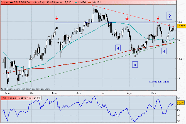
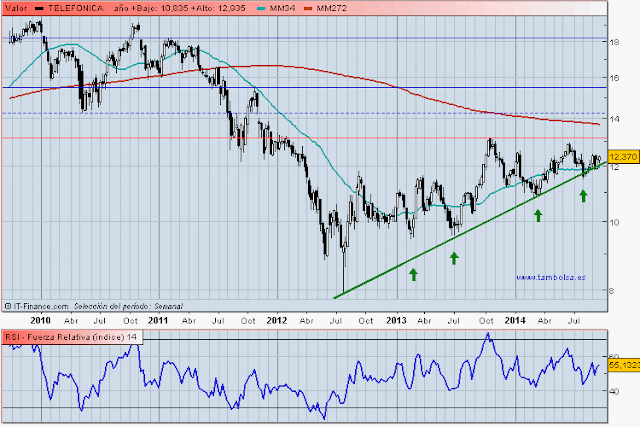
Fuente: Robert McHugh    Safehaven.com   www.technicalindicatorindex.com


The stock market generated a confirmed and official Hindenburg Omen Friday, September 19th, 2014, as a second observation occurred Friday, after a first observation on Thursday, September 18th. It means that an official H.O. potential stock market crash signal is now on the clock. This is a new development over the past few days. What is so troublesome is the timing, that it comes at the precise same time that a rare and important and dangerous Bearish divergence is occurring between the NYSE cumulative Advance/Decline Line and stocks, and also is coming at the same time the long developing multi-decade extremely dangerous Bearish Jaws of Death pattern looks complete. This confluence is very dangerous, and it is arriving at the seasonally worst time of the year for stocks, the September into October timeframe.
All four conditions for Friday's Hindenburg Omen observation were met, as :

-NYSE New Highs came in at 128 with New Lows at 102, the lower of the two coming in at 3.14 percent, above the 2.20 percent required threshold. 
-New Highs were not more than twice New Lows. 
-The McClellan Oscillator was negative, and 
-the 50 day moving average is higher than it was 10 weeks ago. 

All conditions were met. We needed two H.O. observations within a 30 day period for an official Hindenburg Omen potential stock market crash signal to be on the clock for the following four months. This has now occurred. This is a sign that the market is fragile, and susceptible to a large decline. About 25 percent of the time, an H.O. precedes a stock market crash. Every time there has been a crash over the past 27 years, with the exception of the mini-crash of the summer of 2011, an H.O. was present. Well we have another one now. 
However, as if that is not enough, the important technical analysis news I want to discuss tonight is that there is now an important and rare Bearish divergence between the NYSE cumulative Advance/Decline Line and the stock market as represented by the Dow Industrials and S&P 500. The divergence is evident since the beginning of September 2014. This is one key sign we have been watching for to identify a possible top for the two decade Jaws of Death pattern which will end the Bull market that has lasted several centuries and mark the beginning of a major economic collapse and stock market plunge. The divergence is occurring very rapidly but as far as depth for the divergence, it is meaningful and comparable to the last time we saw this, which was just before the October 2007 stock market top, which signaled the beginning of the Great Recession. This rare divergence was also present just prior to the start of the 2000 to 2002 economic recession and stock market crash. 
Originally I was thinking we are going to see a 5 to 10 percent stock market correction over the next month. However, with the official H.O. observation suddenly on the clock, and the NYAD Bearish divergence occurring, and stock prices sitting at the top boundary of the multi-decade Jaws of Death pattern, we could see the next decline be far more serious than a 5 to 10 percent correction. All of the above means that under-the-surface market psychology is now turning grossly negative. We can expect to see black swan events -- geopolitical, economic, weather, social unrest, and natural disasters that generate selling fear in the stock market.
Alibaba came out today with the largest Initial Public Offering ever. This is a Chinese e-commerce company and investors actually bought units from a holding company in the Cayman Islands, instead of stock. The media hype around this offering was embarrassing. I think I actually saw drool from the lips of several commentators covering the story today. Friday saw stocks mixed, with Demand Power falling 1 to 362 while Supply Pressure rose 6 to 366. Now this is very unusual stock market supply and demand disequilibrium behavior. It tells us that there was considerable downside selling pressure Friday, however deep pockets intervention came in and bought the market hard to prevent a sharp decline. Think about this. Why would deep pockets care so much to buy the market hard today? Alibaba? Wall Street was underwriting this behemoth. Not a good day to let the market tank. But the market wanted to tank.
The Fed will now be pulling liquidity out of the market. With its discontinuance of QE Bond buying, and its huge position in fixed securities issued by corporations and governments in the economy, the process of maturing issues and interest coupon payments owed to the holder of the securities - the Fed (trillions of dollars of these securities) means cash (liquidity) will be flowing to the Fed from the issuers of these securities, essentially pulling money out of the economy into the Fed. This is monetary tightening at a very bad time and will contribute to the coming economic trouble. The Fed's QE essentially kicked the can down the road to now. But now cash has to return to the Fed by virtue of the Fed holding trillions of securities. This will slow the velocity of money and tighten lending. The time has arrived to pay the piper.
Another reason for great concern about the stock market at this time: Fewer and fewer stocks are participating in the 2014 rally. Bearish Divergences are all over the place right now, between prices and the Secondary Trend Indicator (formerly known as our proprietary Technical Indicator Index), between prices and the S&P 500 10 Day Average A/D, between prices and the NDX 10 Day Average A/D, between prices and the Russell 2000 10 day average A/D, and between prices and Blue Chip Demand Power, and between prices and the NDX Demand Power, all of which continue to build this week. I would not be surprised if this is telling us stocks will top soon if they have not already, and then we see a selloff into our October Phi Mate and the Bradley Model turn dates, October 7th and 9th. We show charts of these Bearish Divergences on pages 10 through 13 in this Weekend's Report.
Another Bearish development at this time is a divergence between small caps and blue chip stocks. Also Bearish, is the Russell 2000 is very close to seeing a Death Cross where its 50 day moving average drops below its 200 day moving average. That usually results in a strong subsequent decline. We show this potential Death Cross and Bearish divergence on page 44.
On Thursday, September 18th, 2014 the Census Bureau reported that housing starts fell 14.4 percent in August. While a topic for another day, I am predicting a Housing crash is coming to the U.S. over the coming years. There are a ton of reasons for this which I will write about in future newsletters. The factors I see occurring will make it almost impossible for the Housing market to recover without a significant paradigm shift. Many of the reasons I see are hidden from public view and media discussion. There are machinations in place that deeply discourage property ownership. Socialist machinations that penalize ownership.


Otro interesante artículo sobre el tema:
http://esbolsa.com/blog/analisis-tecnico/hindenburg-omen/

Descripción de la pauta Hindenburg Omen


Fuente: Jose Luis Cárpatos   Estrategiasdeinversion.com


Esta es una señal técnica curiosa, muy conocida en EEUU y muy poco en Europa, que tomó el nombre de la famosa catástrofe del dirigible alemán Hindenburg que se estrelló el 6 de mayo de 1937, dicen que por culpa de un tripulante que, animado por su novia que era militante antinazi, le animó a colocar una bomba incendiaria a bordo. 

Esta señal técnica consiste en lo siguiente: 

La inventó Jim Miekka editor de "The Sudbury Bull and Bear Report ". Se activa cuando la media de 10 semanas del NYSE Composite Index, basándose en los cierres al viernes está al alza, si está a la baja no vale. La segunda condición es que el famoso McClellan Oscillator esté en zona negativa. 

Si estas condiciones se cumplen, se mira el número de nuevos máximos y de nuevos mínimos. La teoría es sencilla, en un mercado alcista la señal de que se empieza a dudar, que será el aviso de que viene la bajada, se dará cuando se vea un gran número de valores en nuevos máximos y a la vez otro gran número de nuevos mínimos, es decir, empiece un período de confusión o turbulencia, con divergencia clara de opiniones. 

Según Miekka, lo mejor es esperar a un día en que haya como poco 79 nuevos máximos y nuevos mínimos. Es decir, ambos deben estar por encima de esa cifra. Entonces hay que dividir el más bajo de los dos números, ya sea el de nuevos máximos o el de nuevos mínimos, por el total de valores y multiplicarlo por 100. Si ese resultado está por encima de 2,2, cosa que muy raras veces sucede, se tiene una señal de "Hindenburg Omen". Algo que cada vez que ocurre, insisto por ser poco frecuente, levanta mucha polvareda. 

Desde luego que tiene mucho sentido eso de que cuando en una tendencia alcista el mercado empieza a dudar hay que estar atentos, pero debo advertir que hay que manejar este indicador con sumo cuidado y darle una importancia relativa. Es un indicador más, todo los indicadores son interesantes, pero de ninguna manera un oráculo que no falle nunca. 

Personalmente, dudo mucho que esta señal sea un indicador casi infalible de bajadas pronunciadas. Por ejemplo, en marzo de 2001 el indicador saltó, a los pocos días se perdía casi el 3% y, sin embargo, al cabo de un mes de saltar la señal, se subía con una fuerza tremenda por encima del 10%. Es decir, desde que saltó la señal el mercado había subido casi el 13%. Sin embargo, en el 2004 acertó y a finales de junio del 2002, donde volvió a saltar, anticipó una bajada, aquí realmente brutal. 

Pero ha habido absolutamente de todo, bajadas y subidas y no parece fiable más que como una cosa más. Sin embargo, sí me llama poderosamente la atención un cálculo realizado por Jason Goepfert de Sundial Capital Research que calculó todas las veces en que había aparecido la señal desde 1965. En total 35 veces solamente. Pues bien, a los 10 días sólo en 13 de 35 veces se estaba alcista, con una media de pérdida del 0,6%. Y, vean qué curioso, a los 30 días sólo el 49% de las veces se estaba alcista, con una media de pérdida, siempre en el SP, de 0,7%, y el caso es que a los 120 días sólo el 40% de las veces se estaba alcista, con una media de pérdida de 0,4%. 

Creo que estos datos de Goepfert son decisivos y dejan bien a las claras que el Hinderburg Omen es sólo un indicador más que, como todos, a veces acierta y a veces falla, y que no predice en realidad un crash (los porcentajes medios de bajada son muy modestos) pero sí es bastante fino para predecir (aunque no siempre, claro está) períodos de clara debilidad de las bolsas norteamericanas. Por supuesto, esto habrá que cotejarlo con otros datos y otras muchas cosas, pero les he hablado hoy de todo esto porque siempre nos viene bien conocer un nuevo indicador y que además está de moda y es muy seguido. 

McHugh introduce una aportación que es filtrar más la señal para evitar señales falsas y le añade dos condiciones más: 

1- Que los valores que tocan máximos de 52 semanas en el NYSE no pueden ser más del doble que los que tocan mínimos (recuerden que la señal se basa en que haya un gran número de valores a la vez tocando máximos y mínimos, pues esto nos indicaría confusión tras una tendencia alcista y por tanto posibilidad de vuelta) y viceversa. 

2- Para confirmar deben aparecer al menos dos señales Hindenburg Omen en un plazo de 36 días. 

Tras ampliar las señales con estos dos filtros, McHugh se da cuenta que las señales son menos frecuentes: poco más de 20 en los últimos 21 años, en casi 5.000 días de trading. Ya ven qué poco frecuente es. La señal gana mucho en efectividad y todas las grandes caídas han sido predichas por señales de este indicador en todo ese tiempo, aunque no siempre que se ha activado ha aparecido una gran bajada. 

Las conclusiones y porcentajes de McHugh son éstas: 

Cuando una señal con estos filtros de Hindenburg Omen se activa: 

- Hay un 41% de posibilidades de un crash mayor (más del 15 % de bajada). 

- Un 54% de una bajada mayor del 8%. 

- Un 77% de una bajada de al menos el 5%. 

A título de curiosidad, podemos ver que en el crash de 1987 la señal apareció el 14 de septiembre y en el pinchazo de la burbuja el 24 de enero del 2000.